How to design more actionable edtech dashboards: part 2—design examples


Level of interest and requests from you!
I was blown away by the nearly 6,000 reads of my LinkedIn blog of July 16, 2020 about how to design more actionable edtech dashboards. I received many enquiries to ask if I could provide mockup designs to illustrate the eleven guiding principles in action. So, I worked with a creative designer on four illustrative examples. I hope they help!
First, a reminder of the eleven design principles I proposed:
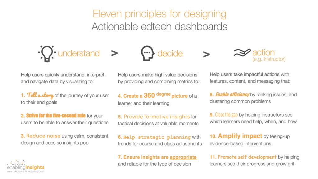
Customer-centered and outcome-driven dashboard design
Second, a quick summary of the methodology that I use with product teams and recommend for edtech dashboard design:
- Partner with your target users and customers, and involve them throughout the process.
- Start at the end, by developing a clear understanding of the outcomes they are trying to achieve.
- Understand the decisions they are trying to make and why, day to day, week to week, month to month.
- Understand the types of actions they can or would like to make based on those decisions. For example, deploying materials, meetings, people, or communications.
- Start your designs in black and white, but only after you’ve nailed 2-4. Designing in black and white forces you to focus on what’s most important for your users and visually simplifying it for them. Only re-introduce color when you have a solid set of designs.
In an upcoming blog I will share the framework I use to guide the ideation (steps 2-4) with users and products managers.
A few health warnings about these sample designs
Third, a confession. I’ve broken my first rule! I did not incubate these illustrative designs with customers (though they are based on 27 years of working with instructors). With that important caveat in mind, please note:
- These designs are illustrative only. Their goal is to illustrate the design principles. They are not meant to be final product designs. They have not been refined and validated with customer feedback.
- Good design is unobtrusive. So, if these designs do a good job, they will not be startling. Instead, they will “get out of the way” to enable understanding, decision making, and high-value actions.
- An example of courseware for US higher-education instructors. These designs illustrate dashboards for instructors using a fictional courseware product for US higher education. The insights and actions are therefore geared to those students, instructional models, and recommended data. (I will post in an upcoming blog examples for a K12 product.)
Design example 1: class weekly performance trends—to help instructors to make course corrections
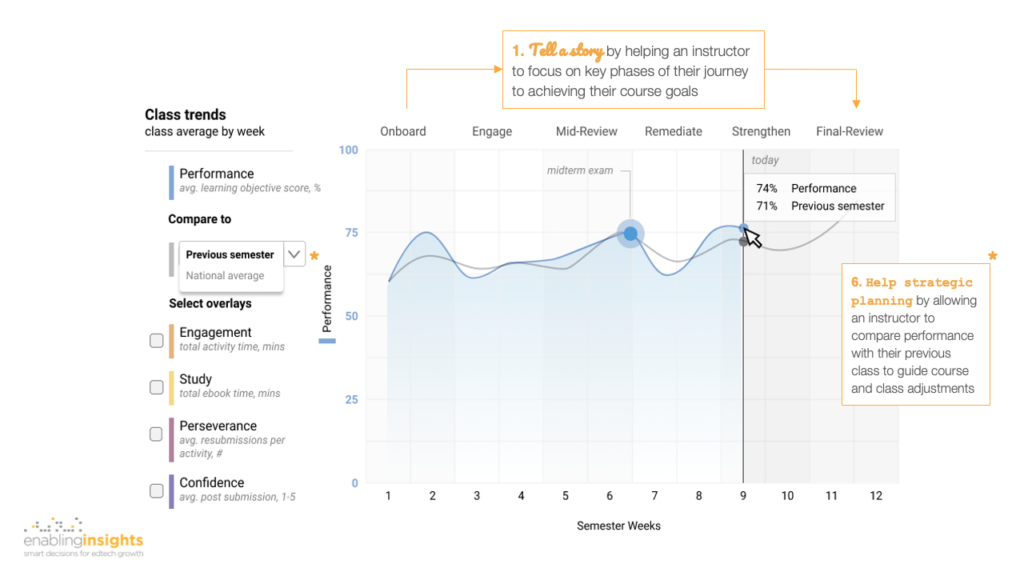
We start with a screen showing class-level view of performance, week by week, through the semester until today (week 9). Note that all results shown are averages for the class as a whole (indicated top left).
Along the top, we tell a story to help an instructor to see their semester-long journey and key phases of how to engage, motivate, and intervene with their students to achieve course success.
Second, to help the instructor with strategic planning—that is, course-level adjustments and class-level corrections—they can add an overlay to compare progress with a previous class or a national average (of other users of this product, anonymized). For example, we see that the previous class also struggled after the mid-term exam.
Design example 2: class weekly 360-degree view—to give instructors a richer context to understand performance results
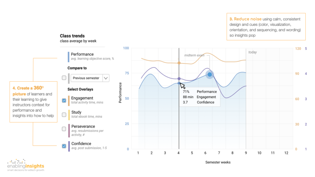
Class performance (e.g. average % correct on learning objectives covered that week) is clearly a critical metric. But, it’s much more insightful when coupled with student engagement, effort, and confidence to create a 360-degree picture (I use 360-degree euphemistically, since face-to-face interaction is essential to build a complete picture). So, in this screen we illustrate how an instructor can add overlays of, in this example, engagement (time spent on activities per week) and confidence (post submitting an activity).
We have also chosen to sequence these measures to tell a story of a “learning journey”—where performance (the end outcome) is the consequence of a student engaging with homework activities, studying using the ebook (where and when they need it), persevering (when they’re unsuccessful), and building confidence.
We’ve been careful to reduce visual noise by adopting a single and consistent color for each metric—for the key at left, plot lines, and axis numbers at left and right. You will see the same color and “learning journey” sequence appearing in subsequent screens. This helps build familiarity for the user and reduce cognitive load so they can more quickly understand what they’re seeing, from one screen to the next.
Design example 3: student weekly 360-degree view—to help instructors to efficiently identify which individual students to help and how
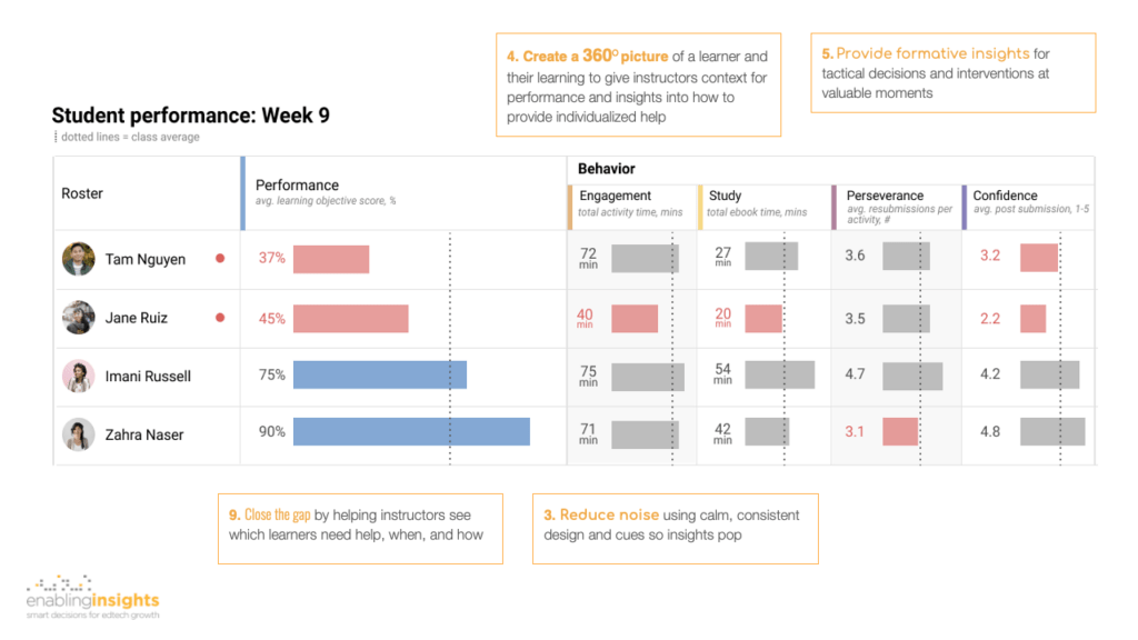
In this screen, the instructor has drilled down for more insight into each of their students individually.
This is where the 360-degree picture of each learner provides critical context for understanding the “why” behind each student’s performance. For example, student Jane is performing lower than the class average, but she is also spending less time on homework and studying using her ebook. She is also generally lacking confidence. By contrast, Zahra appears to be naturally acing the homework but gives up when she hits a hurdle. These metrics and the visualizations are designed to help the instructor to efficiently identify students in need and provide richer context of how to help. They help close the gap by bringing the instructor closer to each student and provide formative insights to dynamically help, week-to-week.
You’ll see we’ve adopted the same color and terminology for the Behavior insights as presented on the previous screen to reduce noise and build cognitive familiarity. They are also sequenced along the same “learning journey” so instructors can see if students are maturing each behavior (engagement, study, perseverance, and confidence). We have chosen to use a single visualization—a bar—for all metrics, and used color (red) only to show students and measures below class average. This helps the instructor to quickly scan and identify problem areas and potential relationships without having to do mental gymnastics between different visualizations (e.g. bar, line, dial, pie).
Design example 4: student intervention clusters—to enable instructors to efficiently help groups of students
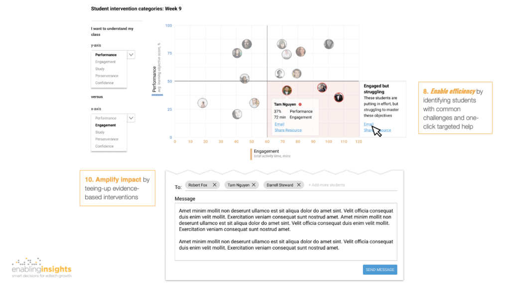
Finally, we contrast the previous screen with one illustrating how to enable efficiency for the instructor at the class level. In this screen, an instructor can chose to compare, say, Performance with Engagement. Students who are highly Engaged (>60 mins weekly on homework), but not Performing well (<50% average score on homework) are clustered and efficient, targeted, one-click interventions offered to the instructor to amplify their impact—share a key resource (e.g. a section in the ebook or a remediation activity), or an email (perhaps with recommended wording such as encouraging a growth mindset, or a small-group activity).
Need help? Have feedback?
Here’s a downloadable PDF of these designs. In forthcoming blogs, I’ll share examples from a K12 product, and also the framework I use to guide ideation with users (for outcomes, decisions, and interventions).
If you want a fast and incisive assessment of your current dashboards and practical tips for how to evolve them to be more actionable for your users and competitive in the market, we’d love to help. Please contact us today with the form provided below. We also welcome your feedback or questions—just use the form and title “Your challenge” with the word “Feedback”.